I did it again and forgot to make time to update more regally on the university major project work. But aspects visually have changed since my last update so I have been trying to keep on top of the workload.
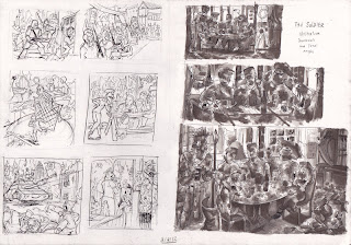
First off here are the other thumbnails and tonal roughs for the last few ages Solider, The Justice, old Age and Mental dementia and death.
I should have pointed out earlier that I have been referring to a different text that describes the 7 ages of man in modern terms rather than the original monolog. Which is something I really have neglected up until now but I will talk about that near the end of this post.
I decided after I had done the thumbnail stage to draw one of my roughs on to a bigger format like A3 and complete it as a final piece. I chose Mental dementia and death roughs because I thought it could help me explore and understand how visually crazy and packed this universe was going to look. Also I wanted to see if my pen skills could pull off a better effect then the grey pro markers I have been using for tone for the majority of the project.
 |
I was like a tank with this experiment and ended up creating a very big mess of images that were interesting. But the viewer’s eye could not get engaged or focus on anything important that I wanted them to see first. So their eye would wonder around the image lost. Their needed to be a distinction between depths and subject the mark making just blurred it altogether.
This also made me think about changing the size of my finals or just doing them on a smaller size then experimenting with scale later on.
After I felt satisfied with my tonal roughs and general layout for the illustrations it was time to start the pencil stage in this process I continually reworked over certain elements and poses in the characters to get the closet image I imagined for that age.
I started with the infancy sketch and went ahead and inked it in with fine liner pens. I tried to cerate textures and line work similar to the woodcut artist Gustav Dore who had inspired my interest in the pervious project using a variety of lines in my visual language.
I tried to balance out the detail and negative space so the focal subject of the piece (the human baby) was visible and did not get devoured in the chaos like I did with my mental dementia and death A3 illustration.
I received critical feedback on my use of media and understanding of depth and effective tones. The problem was that every time I looked at Gustav Dores tonal values I tried to apply it in realistic terms by comparing it with my own photography, this in turn made some of the foreground characters look much more flat then they are supposed to be. Example the lizard in the bottom right corner should really be set against a much darker back drop in order for him to pop out.
Taking all this on board I spent a whole week on finalizing pencils for all the illustrations so I had at least a good sustainable foundation on which to refine and rework the sketch before the inking stage would begin.
|
Going back what I said at the start of this blog I started thinking about story or concept of the project. It was all well having a title like the 7 ages of man to illustrate but the big question was why what did I want to communicate and would their be a different type of format I could associate with the illustrations. Someone suggested a book or editorial design because it would give me something to produce which could be much more beneficial then just a galley
Exhibition.
At this stage I was like a tank with my visual work and would just go for it and not stop to take a breather and consider what was I trying to achieve
Just this last week I spent a great deal of time thinking hard about where my project is going and what sacrifices I need to make to achieve a more polished and professional finish I came to the conclusion that making all the pieces portrait would make the viewers eye follow the story of this man much more clearly.
I also have started researching and exploring the narrative some more it needs to communicate the theme and monolog of the 7 ages of man or the project fails.
So far I have made sure that the man is present in each illustration so there is a visual link and I have considered also linking certain elements of each illustration together showing the passage of time and indicating it’s the same person throughout the illustrations.
Until next post LATERS;)


