Thursday, 5 April 2012

Major project week review 4/5/12


I have started inking in my first 2 penciled 7 ages of man illustrations the Childhood and Solider this week. Its important to note I forgot to mention that I have redone some of my landscape pieces to be portrait I find that the illustrations flow better and effectively make the story more readable. This as well gives me the advantage to try out a book format for the body of work I am producing.


I used 0.05 and 0.1 pens for the inking and thickened lines out on the guy so he would stand out as the focal point of each image.


I have made connections to each of the ages using items and characters from other stages in life giving the protagonist in the images some continuity.

until next post LATERS


Monday, 2 April 2012

Major project week review 2/3/12

I did it again and forgot to make time to update more regally on the university major project work. But aspects visually have changed since my last update so I have been trying to keep on top of the workload.

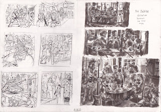
First off here are the other thumbnails and tonal roughs for the last few ages Solider, The Justice, old Age and Mental dementia and death.


I should have pointed out earlier that I have been referring to a different text that describes the 7 ages of man in modern terms rather than the original  monolog. Which is something I really have neglected up until now but I will talk about that near the end of this post.

I decided after I had done the thumbnail stage to draw one of my roughs on to a bigger format like A3 and complete it as a final piece. I chose Mental dementia and death roughs because I thought it could help me explore and understand how visually crazy and packed this universe was going to look. Also I wanted to see if my pen skills could pull off a better effect then the grey pro markers I have been using for tone for the majority of the project.
I was like a tank with this experiment and ended up creating a very big mess of images that were interesting. But the viewer’s eye could not get engaged or focus on anything important that I wanted them to see first. So their eye would wonder around the image lost. Their needed to be a distinction between depths and subject the mark making just blurred it altogether. 


This also made me think about changing the size of my finals or just doing them on a smaller size then experimenting with scale later on.

After I felt satisfied with my tonal roughs and general layout for the illustrations it was time to start the pencil stage in this process I continually reworked over certain elements and poses in the characters to get the closet image I imagined for that age.


I started with the infancy sketch and went ahead and inked it in with fine liner pens. I tried to cerate textures and line work similar to the woodcut artist Gustav Dore who had inspired my interest in the pervious project using a variety of lines in my visual language.


I tried to balance out the detail and negative space so the focal subject of the piece (the human baby) was visible and did not get devoured in the chaos like I did with my mental dementia and death A3 illustration.

I received critical feedback on my use of media and understanding of depth and effective tones. The problem was that every time I looked at Gustav Dores tonal values I tried to apply it in realistic terms by comparing it with my own photography, this in turn made some of the foreground characters look much more flat then they are supposed to be. Example the lizard in the bottom right corner should really be set against a much darker back drop in order for him to pop out.


Taking all this on board I spent a whole week on finalizing pencils for all the illustrations so I had at least a good sustainable foundation on which to refine and rework the sketch before the inking stage would begin.


Going back what I said at the start of this blog I started thinking about story or concept of the project. It was all well having a title like the 7 ages of man to illustrate but the big question was why what did I want to communicate and would their be a different type of format I could associate with the illustrations. Someone suggested a book or editorial design because it would give me something to produce which could be much more beneficial then just a galley   
Exhibition.


At this stage I was like a tank with my visual work and would just go for it and not stop to take a breather and consider what was I trying to achieve


Just this last week I spent a great deal of time thinking hard about where my project is going and what sacrifices I need to make to achieve a more polished and professional finish I came to the conclusion that making all the pieces portrait would make the viewers eye follow the story of this man much more clearly.

I also have started researching and exploring the narrative some more it needs to communicate the theme and monolog of the 7 ages of man or the project fails.

So far I have made sure that the man is present in each illustration so there is a visual link and I have considered also linking certain elements of each illustration together showing the passage of time and indicating it’s the same person throughout the illustrations.  


Until next post LATERS;)


Sunday, 25 March 2012

sad honey dew (rough).mov


Another Raw Animatic i did just this afternoon i want to see if its possible to create funny successful shorts based off youtubers who do playthroughs with humorous commentary over the gameplay its one of the best things about youtube that I love

Now the Yogscast guys i recently started watching all their minecraft playthroughs including the shadow of israphel so i thought it was fair to animate the infamous scene in season 1 where near the end of the video poor Honeydew gets a nasty surprise when he steps out the back door and xephos i imagined found it all rather amusing

video link:http://www.youtube.com/watch?v=TQBQ0MIpJsk

I really want to finish this off at a higher standard then my Friendship is magic animatic I recently redid because i feel the yogscast guys deserve it.

You should subscribe to them if you're a Minecraft fan

http://www.youtube.com/user/BlueXephos?feature=g-u-u


until next post Laters

my Youtube Account  http://www.youtube.com/user/Jowybean?feature=mhee

Find an improved pet scene


Surprise and behold its the MLP animatic i decided to continue work on in my free time from uni work. The other animatic inspired by a Madness song needs a lot more time and work needed to make it work more fluidly.

With this animatic i tried to cerate the iconic style in human from with my personal touch of course with expressions and backdrop details


Sunday, 18 March 2012

how delightful


Seeing as I have had some free time from my busy university schedule thought I would experiment with something I have not done in a long time animation. 


Ok now considering my pervious attempts at animation, which was awful, this is much more polished. 


Mind you this should really be called an animatic because I did do a couple of storyboard jobs last year (which I should post up on here eventually) I only say its animation because that's the effect I intend to create like this would be a pilot for an animated 2d cartoon or movie.


 this would be a childhood dream come true if I could achieve this 


Anyhow not to ramble on too long but the audio if people do not now is ripped from the soundtrack of the great ps2 game Sly Cooper and the Thievius Raccoonus 
(A game that I wish had not died on me last year)


 The characters are my own recently redesigned on my DA account. The bean guy in the top hat is just named Music Man. Ironically Sir Raleigh the first level boss (and the audio you hear) insipid the design and creation of the Music Man (so its like a tribute as well lol) and yes he would have a stereotypical English accent because it would fit his physical appearance plus I need at least one British character amongst my other creations 


I have started to plan other shorts like this but maybe a little more ambitious and lots more action stay tuned even if this is a one off I think it does its job of making the dialog entertaining and giving me an idea how animated I would make my cartoons be. 


Until next post LATERS ;)


links


DA Account: http://jowywhiteh.deviantart.com/


Facebook: http://www.facebook.com/Jowybean


entire scene including rough background for atmosphere was done on photoshop CS3 using a wacom tablet. 


Audio used is copy righted to Sucker Punch Productions ripped from Sly Cooper and the Thievius Raccoonus soundtrack by Ashif Hakik

Friday, 2 March 2012

Major project week review 2/3/12

Hey again yes it’s been two weeks since I posted up my university development work

I planed to do it every week that did not happen as you can see.

In my defence the workload was much more high than it is now. Originally I set the task of producing a certain number of illustrations 20-30 describing visually the diverse life and motion of this Cool world/ Todd schorr inspired universe. I then realized that without any story or theme to go with the art could end up being just pretty eye candy. Which suits part of my goals for this project but their needs to be a running theme or concept to go with this body of work.
So this week I have looked in to cutting down my illustration size to 7 and looked at concepts to do with this number (Examples 7 deadly sins, 7 days of the week and the poem Mondays Child) this is to make things easy for this stage of the project it may change later on.

The concept I have chosen to develop that shows a lot of creative promise is Shakespeare’s famous theory on the seven ages of man from the play “As You like it”.


I plan to illustrate each age in a separate illustration. But not making it generic or too obvious but complimenting the text describing each stage.


Infancy: In this stage he is a baby


Childhood: It is in this stage that he begins to go to school. He is reluctant to leave the protected environment of his home as he is still not confident enough to exercise his own discretion.


 The lover: In this stage he is always remorseful due to some reason or other, especially the loss of love. He tries to express feelings through song or some other cultural activity.


I would like to get some feed back from other students to see if my tonal roughs work for the titles they are illustrating.

I am continuing this routine for the other ages over this weekend.

Until next post LATERS

Friday, 10 February 2012

Hey The 3rd year is here


Its been a good couple months since I posted anything on my blogs it’s a bad habit and this stuff is not rocket science. Anyhow I want to document my final uni project here from now on week by week or month depends on whether I feel the work is suitable to my intentions and worth discussing I am not sure how this will go but we will see.

Major project 2012 Week 2 review

So I have started my final major project returning to the cool world/Roger Rabbit concept where in the negotiated I intended to cerate a universe where animation and reality were juxtaposed but in my own unique twist and in a graphic novel format.

My proposal for this project is to produce a series of eye-catching illustrations that show this world I imagine and explore it in detail. There may be a running theme for the whole collection as the development of the visuals constantly counties.

 But for starters I wanted to focus on one of the weaker sides of my pervious brief my tonal contrast and values this was an issue that appeared in my sequential comics and I wanted to resume this issue this week.

I brought sets of grey pro marker pens that I had used in the negotiated and practised my tonal contrast looking at the same practitioners that personally I thought executed form and tone best.


\

Because this universe has so much packed in to it I had to resist temptation to incorporate all the ideas characters and references in to one image. Instead

I took a screenshot from one of my favourite time-lapse videos I liked and used it as a basis for the whole image where my influences in the animation would show and reference other media or cartoons.


This is the result I have at the moment looking at value in a fresh new way brings new possibilities to my visual language because I have used traditional methods of tonal contrast then relying on digital and its much more rewarding and closer to the my major influences the pens almost act like pigments because you can rework areas and darker them subtlety.


I know plan to finalize this image using better quality paper or just add a little bit more depth as I only used two pro markers for this experiment.

Until next weeks post when ever that happens laters ;)